Mashoom 6 Release Notes
Much like 5, but sixier
Written
8 min read
Contents
This release wins the award for looking so simple to start with yet becoming nothing short of a epic journey. Maybe the reason for this is this was the first major release where the core product remained basically the same, this release was to improve and create all the parts that support this core functionality.
Make It Look Nice Part 1 - Branding
Up to this point Mashoom was built entirely from Font Awesome icons and guessing what hopefully looks nice. We always knew this was a weakness, but we took the opinion that I still stand by which is that out of looks or functionality, functionality has to win. It's also not something that comes naturally to coders in general I think, certainly not me!
So, this is where Jacob Aboody comes in. He is not only very good at knowing how things need to look but he also has the all important toolkit and skills to be able to make all the assets that are required to make things look nice.
Mashoom has up to this point had a fairly brutal colour scheme; black, white and red. This looked very harsh and having such a limited colour pallet also meant that interfaces become very difficult to make look vibrant or interesting. So we sat down and came up with a whole new set of colours, two blues and an orange were brought in and the red removed.
This came together whilst designing the new logo. The old one cost a grand total of I think £80 through a startup that I don't think exists anymore, and to be fair, it's served it's purpose well. It gave Mashoom some sort of branding and you have to start somewhere with these things. Lets pay one last homage to the old one, which will also serve to explain why it had to be completely replaced:

What became the elephant in the room is the "M" being much much larger than the rest of the text. This made it nothing short of impossible to place in publications or generally anywhere really, it had to be very large in order to be able to read the "ashoom" part. This was only useful in a few cases when others were placing the logo alongside others, they recognized the same problem and often it ended up larger! Alas, you could still read the others better though... not a good enough advantage.
The other big issue with this logo, it had to be on black! This again limited how it could be used, the biggest issue being when printed on paper. Then the drop shadows being used in the "M", the technical drawing which was printing on the "M" and the standard type face that was used for the other lettering; all not good enough in hindsight.
So, after a million iterations...
Firstly, three main colours, not including the background and none of them black, ooo how lovely. The idea of the "M" being folded has been kept but it's now achieved through colours rather than shadows. It's also been given shrinking tablets / put on a diet to allow the other letters to be noticed. All the letters are custom and have seen many interfaces to get them right, I hope you agree the result is much better.
Another addition is the use of colours to separate out the "Mash" from the "oom". Put simply, the number of interesting ways our company name gets pronounced is hilarious but also obviously not ideal. I stand by the name to the hilt; it's a made up word so we are free to pursue what we want, but this drawback has to be managed. These colours now better guide someone as to how to read the name properly.
Make It Look Nice Part 2 - The Front End Site
Looking back at the Mashoom 5 release notes I find it ironic that this was a main point of that release as well. Previously I knocked together a WordPress site, complete with it's own database and server. Quick and easy... for about 5 minutes! WordPress is really nasty to host on AWS, I'm sure there are methods but when the focus was on getting features coded up and out the door, it wasn't easy to maintain for a lot of reasons I may write up in another blog post.
There are many (and still an increasing number it seems like!) managed WordPress installation providers, but without getting very hands on, they all must be run off a sub domain like we used to have. For SEO purposes we wanted to move away from this, part of this release was to get everything served from the www.mashoom.co.uk address.
We also had got to the point where something more was needed, a custom site with a proper layout and much more thought into how to present Mashoom. It's primarily built on React, which after hearing about down the grape-vine many time I decided to give a go. It's a very very impressive bit of kit and this site was 1000% times easier to put together than I was expecting. I will write up the fully story in another post, but this evolved dramatically as I encountered a whole saga of issues and problems all the way through the release process.
Apart from being able to properly lay out Mashoom's features and benefits, the most important addition is that of our pricing page. Mashoom's pricing is more complex than usual to allow it to scale with use rather than charge per user or a fixed fee. This bring many benefits but one big drawback, which is it's difficult to understand and gain confidence in. We hope the pricing page provides a simple tool that both explains our pricing system and allows users to estimate the cost of their usage. Talking about pricing...
The New Pricing and Billing System
From very early on Mashoom was destined to have this granular pricing structure. However writing a system capable of calculating each account's charges to a granular level meant it took a long time to be deployed. We are so happy that it's finally hear!
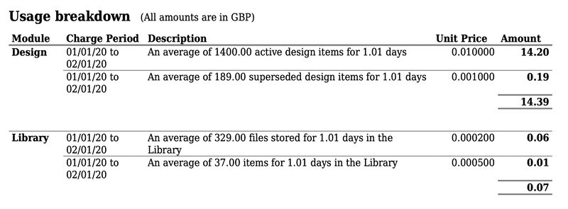
Each month an algorithm runs that looks at the usage of an account and works out the costs applicable. This is probably best described by looking at the breakdown provided on every invoice:

As you can see, the use of each metric of each module is shown, with their individual sub totals and applicable time periods. All calculations are done to second accuracy as the whole of Mashoom runs on unix timestamps. This removes the issues of precisely when the invoice was generated and timezones; prices will be correct no matter what. This also allows us to change the billing frequency although we haven't implemented this yet.
This algorithm will also take into account the precise second a price has been changed, and will create separate lines for each period. It also takes into account a module or feature being deactivated / reactivated within this charging period; prices are precise and fair without any fudge factors.
Fixed prices or 0 pricing can also be set by Mashoom manually. This is to enable our not for profit and fixed price accounts to operate within the same system. Alas, the original specification we aimed for had card payment, but it didn't make the final build for various reason I may put into another blog post.
Account Settings
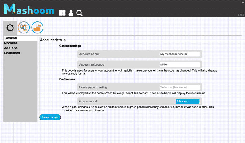
In order to enable the billing system a lot of refactoring work had to be done behind the scenes to centralize logging and get everything straight to allow charges to be calculated. This led into a new accounts settings page which finally includes all the various settings that can be utilized. There were quite a few settings that could be used on request that just didn't have a UI for an admin to turn them on themselves, this has now been rectified.

Another big part of this is that modules and add-ons can be enabled and disabled. This is important now as we are charging for these services; users must be able to turn off everything they are being charged for. Whilst looking a bit thin of the ground at the moment, as Mashoom's capabilities grow we hope this UI lays the foundation to clearly layout the options available to admins for their account.
What Else?
This release was mostly a small number of big items, but there are a few other smaller items:
- The eagle eyed may have noticed that all of Mashoom now runs of the single www.mashoom.co.uk domain, rather than "front." and "user." domains we had previously. This is better for search engine optimization and also removes a few issue with redirection onto SSL
- The design project overview page now doesn't look horrible. It's still due a proper makeover but the default html tables have been sent back to the 90s where they belong
- The BOM and Phl modules have been removed entirely from view, to reduce confusion. These are still on the timeline to be commissioned, but we will keep them out the way until they are ready
